Click image to see the live dashboard
Technologies
Data Ingestion & Processing: Python (pandas) in Google Cloud Run, protocol buffers, parquet
Data Storage: Google Cloud Storage, BigQuery
Data Transformation & Visualisation: SQL, Google Data Studio (formerly Looker)
Purpose
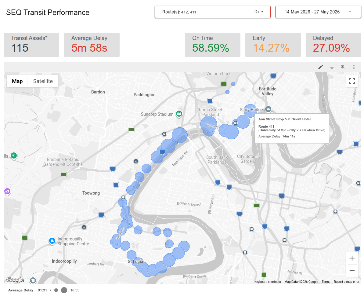
Are the buses running on time? If not, where and how badly are they late? Which routes are consistently late, or consistently early? How well does the fleet perform at peak hour versus during the middle of the day? Why does Translink have open data, but not an interactive dashboard where I can see all of this?
I aggregate Translink’s real-time trip updates every few minutes, flatten that data and save it into parquet files which are saved in Google Cloud Storage buckets, with lifecycle rules so they don’t get out of control. I use those as an external source for BigQuery. A star-schema design with real-time updates in a fact table serves as a data source for Data Studio (formerly Looker). The report’s filtering by route, time of day and data date range allows non-technical users to do quite a bit of investigative work themselves.
My report has four pages:
- Overview: high-level performance metrics, and a map showing all stops with average delay time. Filterable by route.
- Stop-by-stop performance: facilitates investigating highly frequent sources of delay on a per-stop basis. Filterable by route.
- Peak time performance: service metrics, along with best- and worst-performing routes by average delay. Filterable by time of day bins.
- Schedule adherence: facilitates investigating the most consistently early and late routes, both of which cause operational problems.